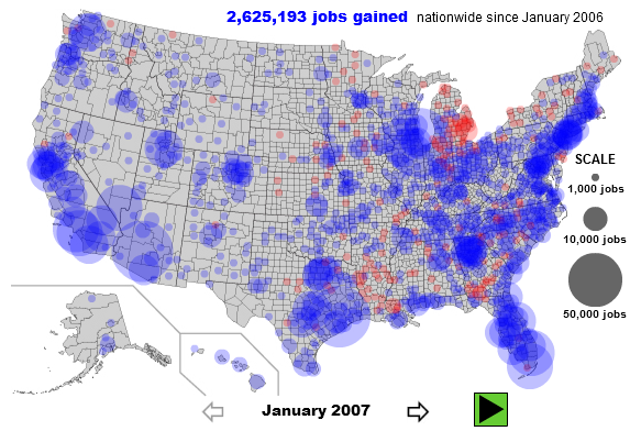
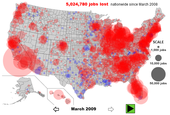
- TipStrategies.com have an amazing visualization of the jobs gained dropping around May 2007 and the job losses really picking up in late 2008. Click here to see the entire video progression http://tipstrategies.com/archive/geography-of-jobs/
- Interactive map of job’s per county on Slate.com. You can interact with the map at http://www.slate.com/id/2216238/. Here are two snapshots contrasting the situation from January 2007 with that in March 2009. The entire east coast, major cities in California, Washington, Oregon and the midwest seem to be most affected with job losses.
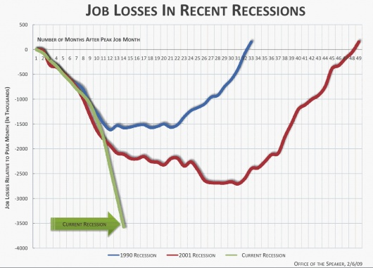
- Flowingdata as always has an excellent post on job losses. This snapshot compares the current recession with recessions in the past and job losses in that recession.
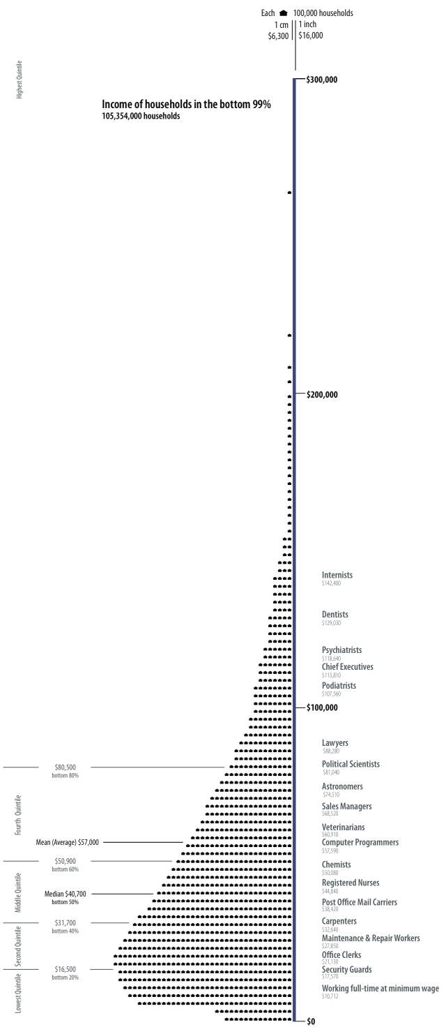
- There is actually a blog titled Visualizing Economics – http://www.visualizingeconomics.com/. One of my favorite posts on this blog is on the relationship between your occupation and the your income. You can download the original pdf or even buy the original poster at http://www.visualizingeconomics.com/posters. Apparently, podiatrists make just a little less than an average chief executive
 . Here’s a snapshot
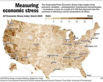
- The Associated Press had a news story where they created a ‘stress map’. The story can be found at http://news.yahoo.com/s/ap/20090518/ap_on_re_us/us_stress_map.You can clearly pinpoint certain regions, but mostly parts of the west coast seems to be affected the most as per their three economic variables – unemployment, foreclosures and bankruptcy. An interactive visualization can be found at http://hosted.ap.org/dynamic/files/specials/interactives/_national/stress_index/index.html?SITE=YAHOO&SECTION=HOME. Here’s a snapshot of the stress map
- FlowingData.com had yet another great post showing a visual representation of the seven deadly sins. Interestingly, Wall Street shows up pretty high on the ‘Greed’ visual representation whereas the Wrath can be seen most in the southern and south eastern parts. Looking at Slate’s job losses map above, one could say that job losses are loosely corrleated with anger and ‘wrath’ in certain regions. Las Vegas Sun ran a story on the study and the related visualizations which can be found at http://www.lasvegassun.com/news/2009/mar/26/one-nation-seven-sins/
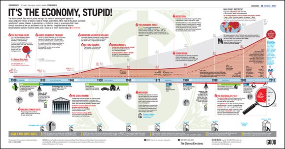
- GOOD Magazine – has an amazing infographic in a post on the economy. Here’s a lower resolution snapshot of the original. A higher resolution image can be found at http://awesome.goodmagazine.com/goodsheet/goodsheet006economy.html
- Investment companies are now making charts to help consumers and clients – Here’s a really nice infographic from Russell Investments
- Users at Many Eyes have been busy visualizing any data that they can get their hands on as regards to the economy
- Visualizing President Obama’s speech on the economy - http://manyeyes.alphaworks.ibm.com/manyeyes/visualizations/obamas-speech-on-economy-october-200
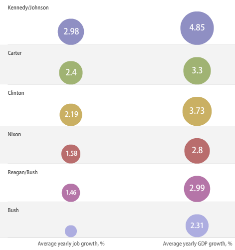
- Visualizing Economy and Presidential Administrations – Wonder what President Obama’s data will look like. Here’s a snapshot of the interactive visualization
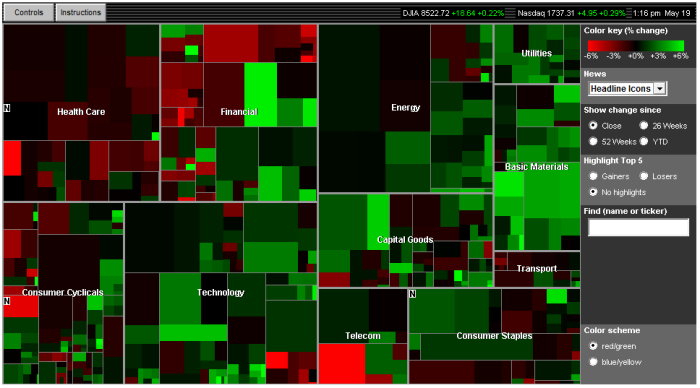
- For those still investing
 , there’s always SmartMoney’s Treemap-based visualization of the Market situation updated in realtime
- Static Visualization of the Dow Jones Industrial Average Index - http://www.mamk.net/?p=1644
- What do people think about the situation right now. Twitter feeds pertaining to the economy – http://spy.appspot.com/find/economy?latest=25
Aucun commentaire:
Enregistrer un commentaire
Remarque : Seul un membre de ce blog est autorisé à enregistrer un commentaire.